
Painting a room can breathe new life into it. You can change the vibe of the entire space, making it someplace to rest and relax, to get hyped up, or to enjoy your family. It all depends on what color you choose.
If you’re looking for a new color to paint your house, consider blue. There are a lot of gorgeous shades that allow you to create any feeling, from bright Caribbean vibes to stately Prussian spaces. Read on to discover how to choose the right shade of blue paint for your home.
Why Use Blue?
Your house should be your sanctuary, someplace you go to rejuvenate and recover from the stresses of day-to-day life. And if you’re looking for a stress-relieving color, there’s no better pick than blue. It creates a sense of calmness and tranquility, and a comforting feeling of stability.
Blue is also great because, unlike bolder colors like purple and orange, it is timeless. Most colors of blue have been in style for decades and will be in style decades from now. You don’t worry about looking at a wall in three years and wondering what you were thinking when you painted it that color.

Where to Use Blue
Blue is a great option almost anywhere in the home. Depending on the size of the room and the shade of blue you choose, you can paint a whole room blue. Or you can use it as an accent wall color or even in thick stripes for a nautical vibe.
Blue is making an appearance as a popular accent color, too. People are painting kitchen cabinets blue, and we can’t get enough of them. And if you want to feel a sense of serenity and security from the moment you walk into your house, you can paint your front door blue!

Pale
There are few things more beautiful than a sky just after dawn in winter, when it looks like it might shatter from the warmth of your breath, hanging over a pristine world just waking up to a new day. Imagine if you could bring that feeling of lightness and rejuvenation into your home every day. Painting with icy blues can make that happen.
Pale blues work well in rooms with lots of natural light since it enhances the illusion of bringing the outside in. It is also a popular color for kids’ rooms.
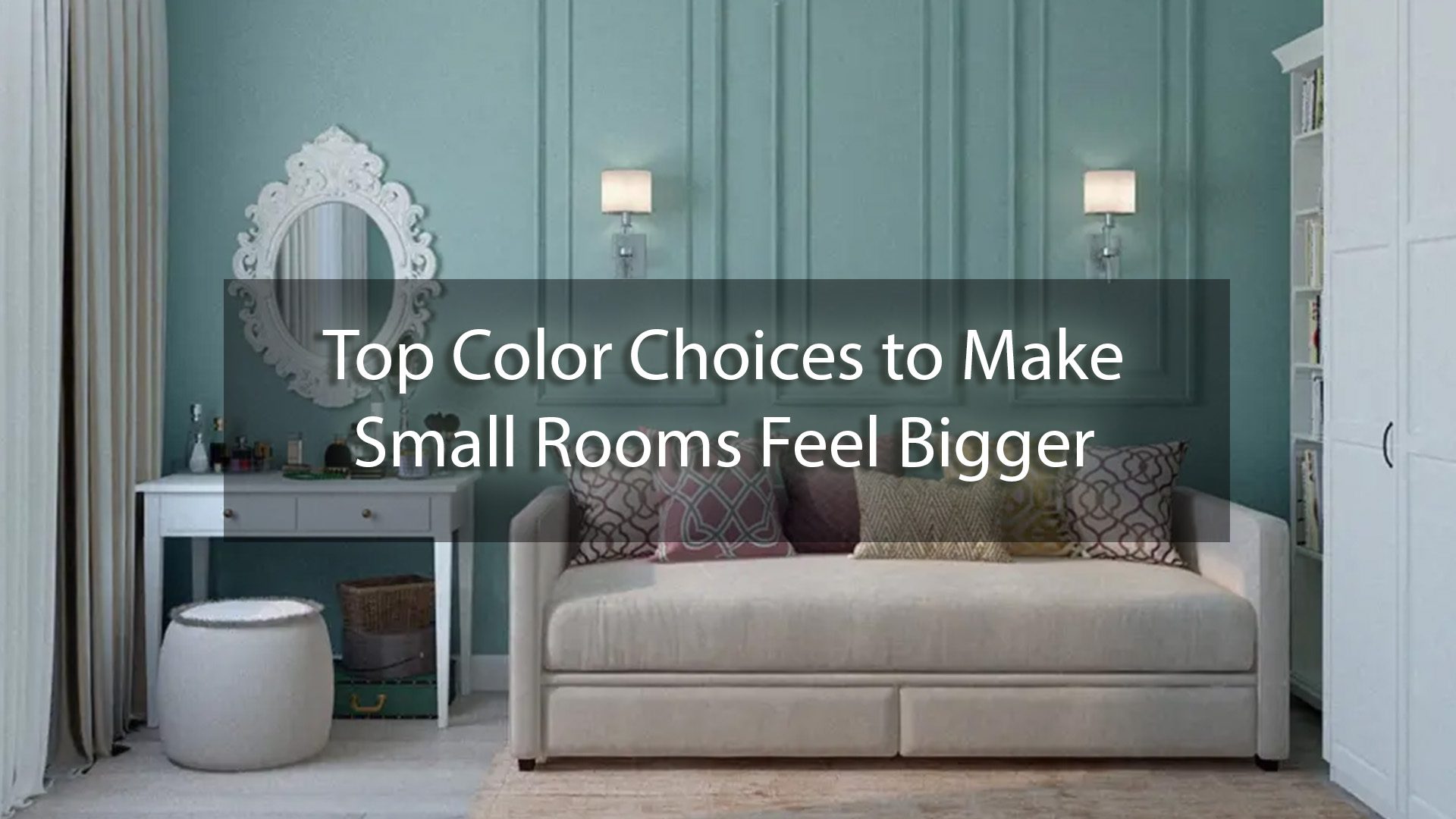
If you have a small space that you need to open up, these airy shades will make the room appear larger than it is. You can decorate with complementary shades of blue paint or with rich contrasting colors, depending on the feel you want for the space.

Gray
Gray-blue provides gorgeous stability and visual weight that some more exuberant blues lack. It brings to mind the way the world feels during a rainstorm, a quiet and focused calm. It also adds a sense of timelessness to a space.
These qualities make gray-blue perfect for an office space, where you want to minimize stress and enhance your ability to focus in on what you’re doing. If you don’t want to do the whole space in blue, paint the wall your desk faces as an accent wall. You can dress up the rest of the space with bright golden yellows to offset the visual heaviness of the paint color.

Bright
Bright blue has almost the opposite effect of its grayish counterpart. It still provides a sense of stateliness, but this time with a pop of color. It has the same subtle exuberance as a summer afternoon sky, full of the joi de vie and possibility.
Bright blue walls are great as a background when you want your room to make a statement. Not only will the walls pop, but they’ll also make anything you set against them stand out more, too. Accents in bright greens, pinks, and yellows will make you feel you’re in a tropical paradise without ever leaving your house.

Green
Green shares a lot of the same psychological effects as blue: peace, rejuvenation, and stress relief. But it also has strong associations with the natural world and healing. When you mix the two together, you get a lovely aqua that can remind you of the tropics or of a peaceful walk in the woods on a spring afternoon.
The lovely thing about the greener shades of blue paint is that you can go as bold or as subtle with them if you like. If you’re looking for a pop of the Caribbean in your home, go for a bold turquoise with bright yellow and orange accents. If you want something a little more calming, try painting your space a soft aqua with darker teal accents.

Navy
If you’re looking for the epitome of that visual weight and timelessness we mentioned earlier, navy is it. This rich jewel tone creates a stately space that can’t help but feel a little more refined. But, navy is a neutral enough color that will stay in vogue for years to come.
If you’re wanting to create a dramatic effect in a small space, try painting the room navy and hanging an accent wall with mirrors. You can also use Prussian blue with coral accents to create a dramatic ocean vibe. Or if you’re looking for something with a little more serenity, look for a navy that has more gray in it.

Learn How to Choose the Right Shade of Blue Paint
Blue is a wonderful color to paint your house. Knowing how to choose the right shade of blue paint can create spaces that range from sophisticated to sparkling, all while maintaining an underlying sense of stability. Bring the beauty of nature indoors and add some blue to your home.
If you’d like to get the beautiful colors you want for your house, reach out to us at SurePro Painting. We believe paint changes everything, and we’re here to help you make that change. Learn more about our SurePro Painting. We believe paint changes everything, and we’re here to help you make that change. Learn more about our residential painting services and start bringing a new life to your home today.


